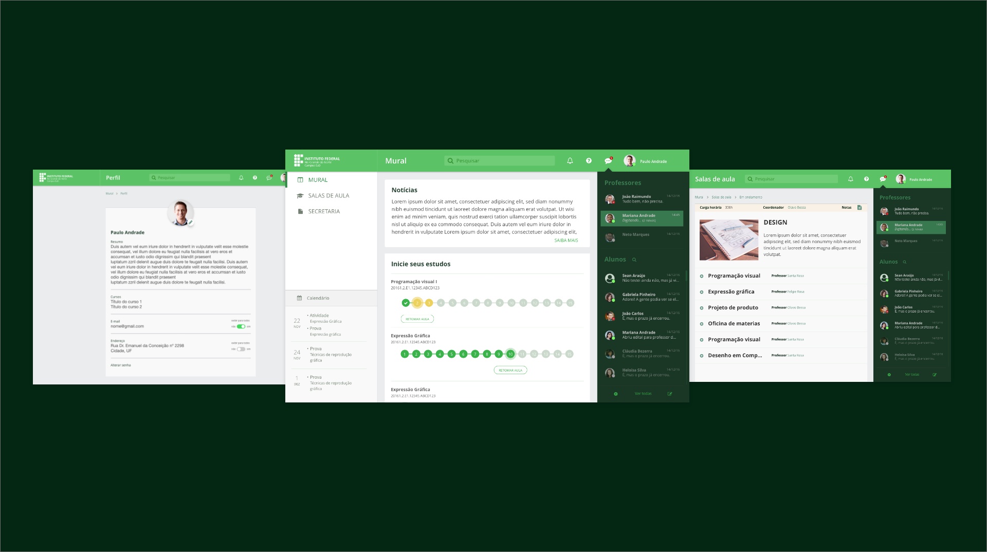
Designing a platform that enables education without boundaries.
IFRN is a well-known educational institute in Brazil. Among its many campuses, there is one in Natal that provides distance education. With the aim of bringing education to hard-to-reach areas in the country, the campus has been using Moodle to deliver learning content and foster a connection between students and educators.
Despite being a widely used platform worldwide, Moodle was not being used to its full potential at IFRN. The platform showed several usability issues, outdated visual design, and many problems related to navigation and user experience. Consequently, the platform did not do IFRN's strong reputation justice, which had been built up over many years.

Responsibilities

The main goal of this project was to identify usability issues, and user needs, and convert them into valuable insights to improve the user experience and interface of IFRN's platform.
Understanding the current situation
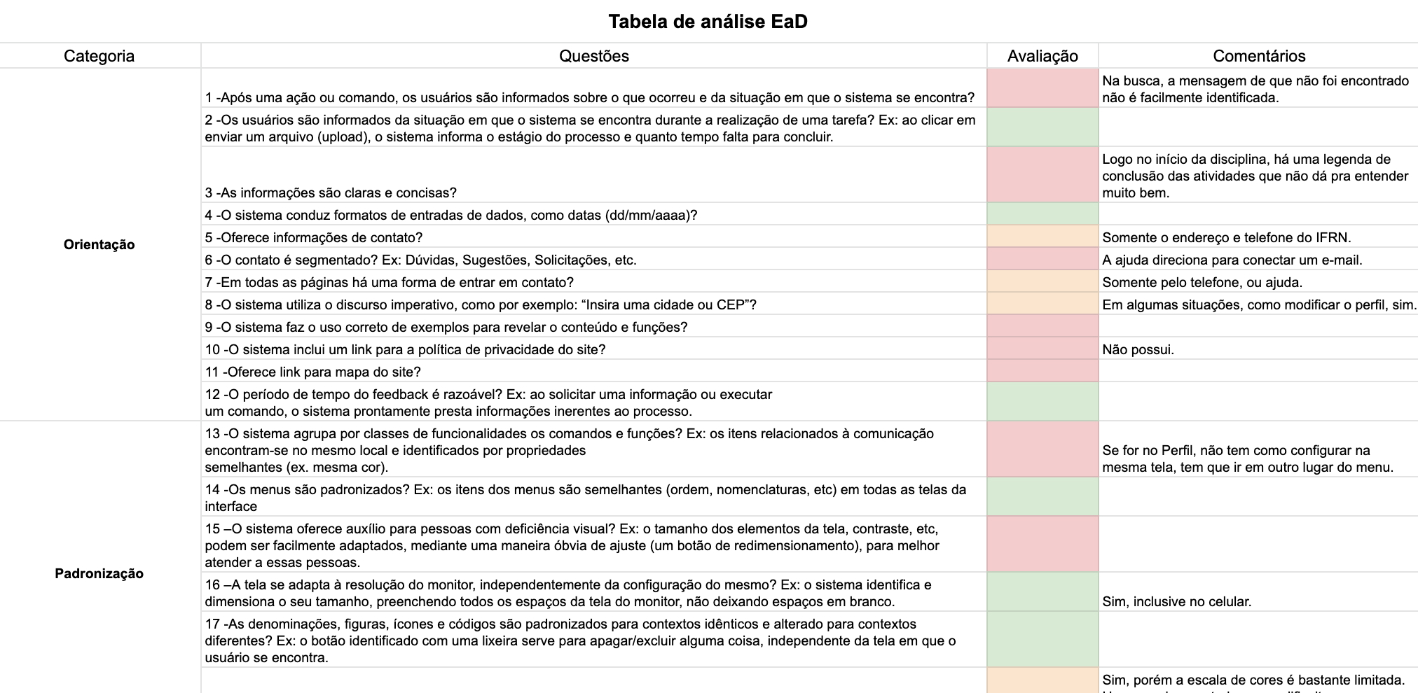
As I did not know much about the product, I decided to conduct a heuristic evaluation to better understand the problems the platform already had. This usability analysis was made by using a checklist provided by researcher Fabianni Roberto Teles, specifically designed for distance education platforms. This allowed me to identify usability issues and categorise them into areas such as orientation, consistency, error management, control and security, adaptability, workload, and communication.
This evaluation helped me to familiarise myself with the platform, gaining a comprehensive understanding of the virtual learning environment, including its features, functionalities, and current user experience.
After documenting the findings from the evaluation, I recognized the importance of gaining a deeper understanding of the actual students of the IFRN educational platform. To accomplish this, I conducted a survey with them to gather insights into their profiles and needs. The data obtained from the survey worked as a foundation for creating user personas and mapping out a user journey.
Understanding the users
After documenting the findings from the evaluation, I recognized the importance of gaining a deeper understanding of the actual students of the IFRN educational platform. To accomplish this, I conducted a survey with them to uncover students' frustrations, satisfactions, and to establish their profiles. So an online survey was sent through the educational platform to all students, with 170 responses.
Survey goals
Data Analysis and Persona Creation
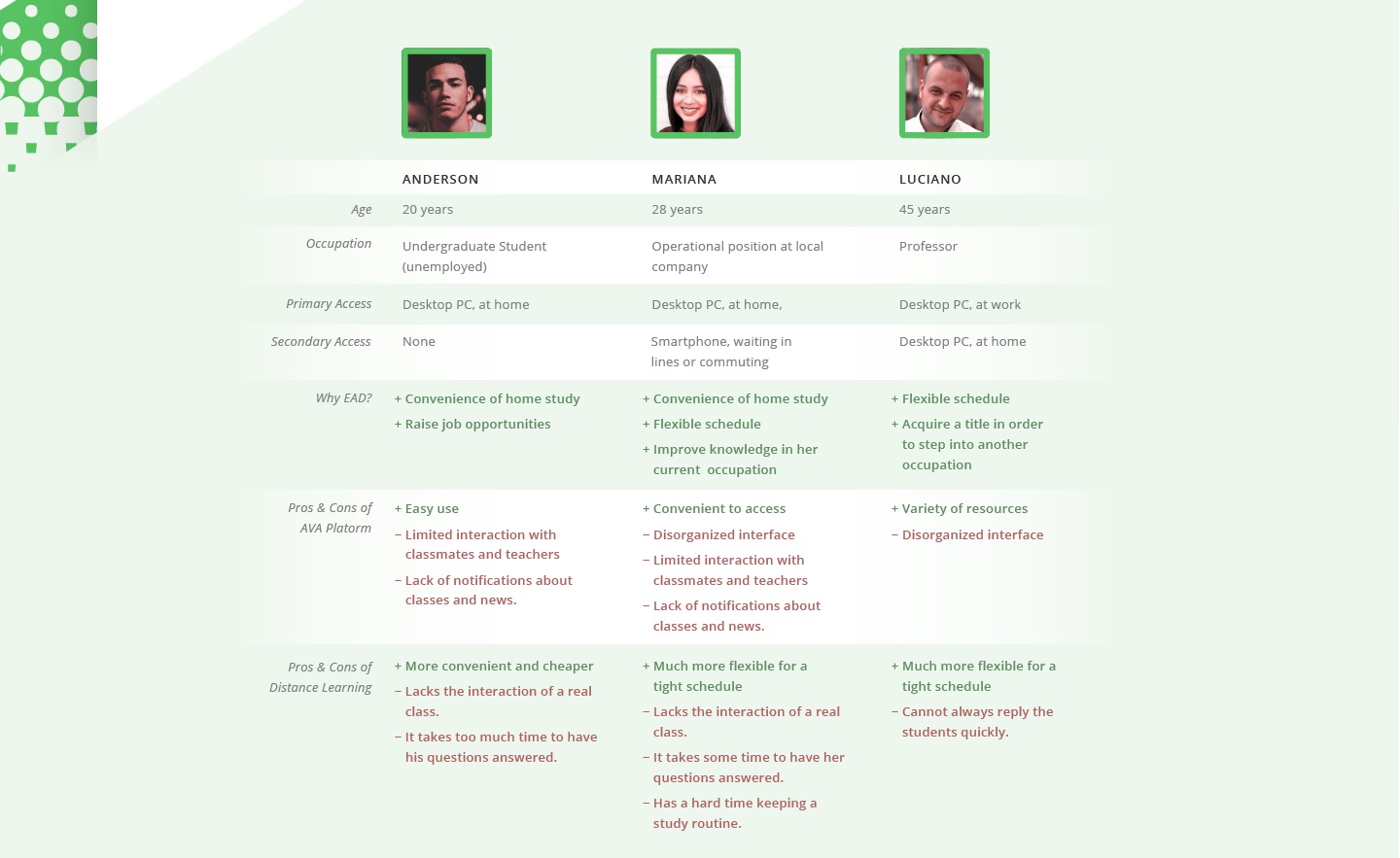
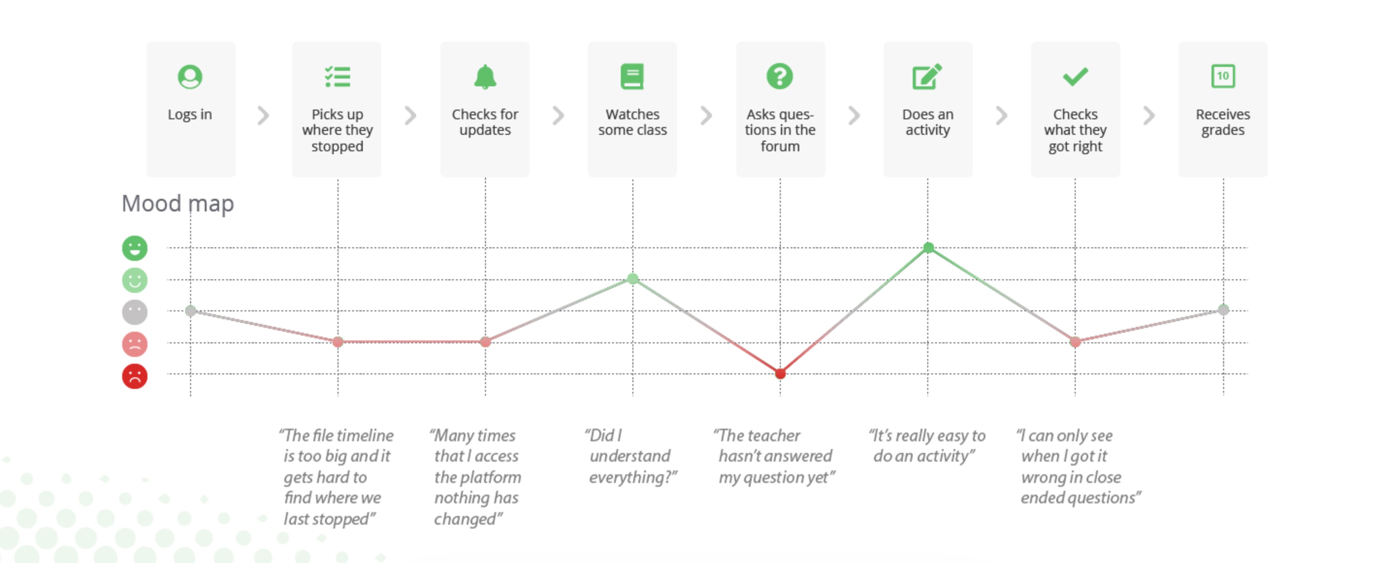
After collecting the qualitative survey data, I examined the responses to identify patterns and group them according to specific subjects. This analysis allowed me to create user personas, mapping out their characteristics, motivations, and goals. Additionally, I used the survey data to develop a user journey and an emotional map, capturing the many experiences and emotions students had throughout their interaction with the platform.
Creating requirements
During this design stage, I analysed the survey responses to identify common themes and synthesise the collected data, transforming them into actionable requirements that would guide the new design and development of the platform. The main things found to work on were:
Creating Wireframes
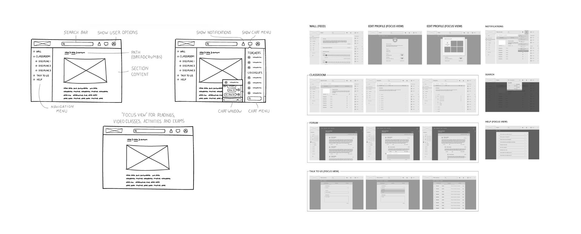
I initiated the process of creating wireframes for the project. The goal was to define the placement of each component on the pages, identify suitable layouts to address navigation issues, and determine the best-fitting elements. Throughout this stage, I collaborated closely with the product manager to make better decisions regarding how the interaction would work.
Visual design
Following many discussions with the product manager, the wireframes were finalised, allowing me to proceed with the visual design phase. During this stage, I worked closely with another designer and we had the opportunity to define the appropriate colour palette, typography, and overall visual style for the project.
Once the initial version of the project was released, the team began receiving feedback regarding the chosen colours. Some users were not comfortable with the selected shade of green. As a result, we promptly initiated an investigation to understand the issue at hand and discovered that the colours did not fully satisfy accessibility standards.

Accessibility
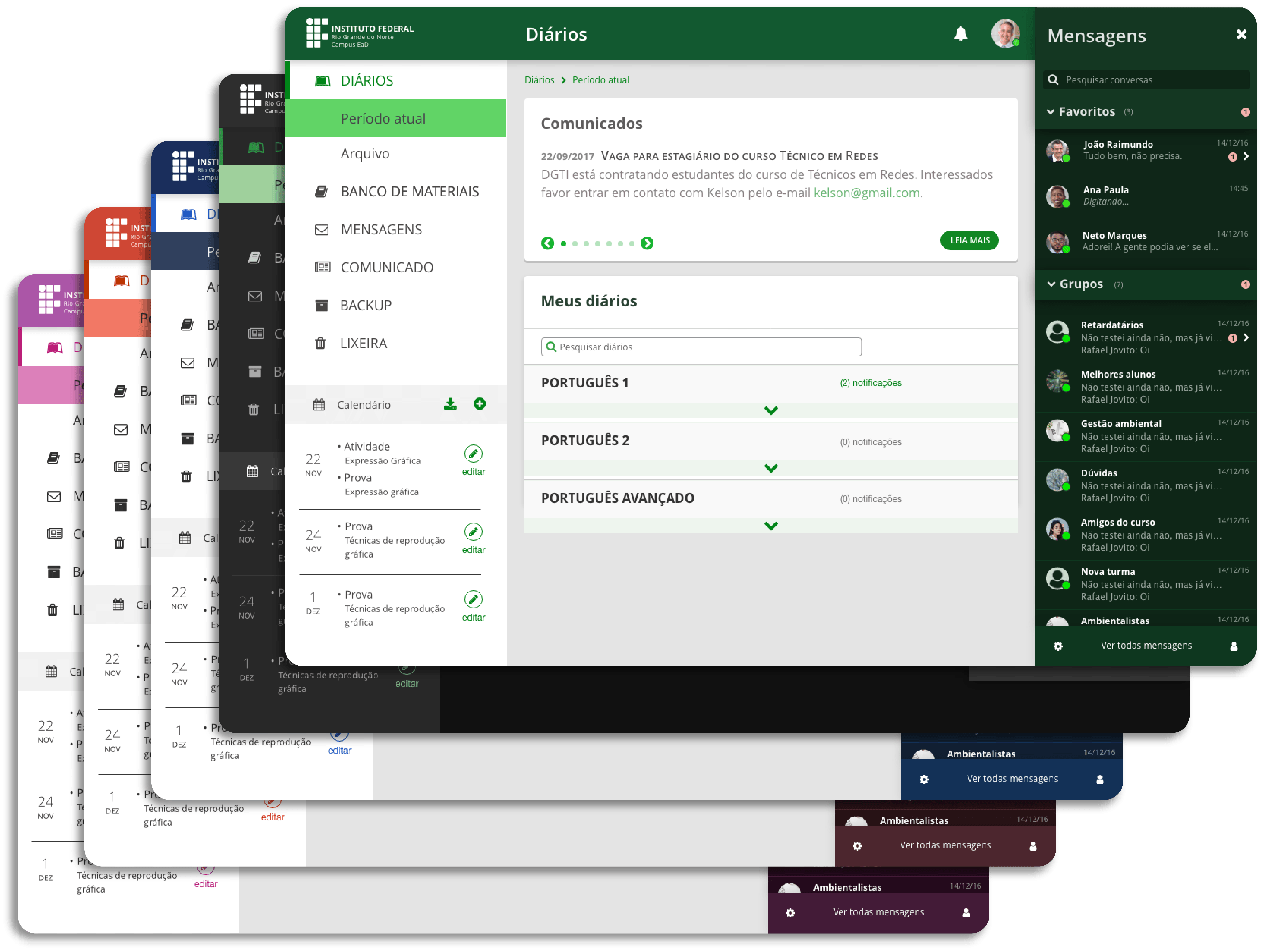
To address the feedback received, the team began developing a range of themes featuring different colour options, providing users with the ability to choose the one that best suited their preferences. Following the Web Content Accessibility Guidelines (WCAG), we ensured that the colours implemented fitted high-contrast standards, minimising any difficulties experienced by individuals with visual impairments.
Style guidelines
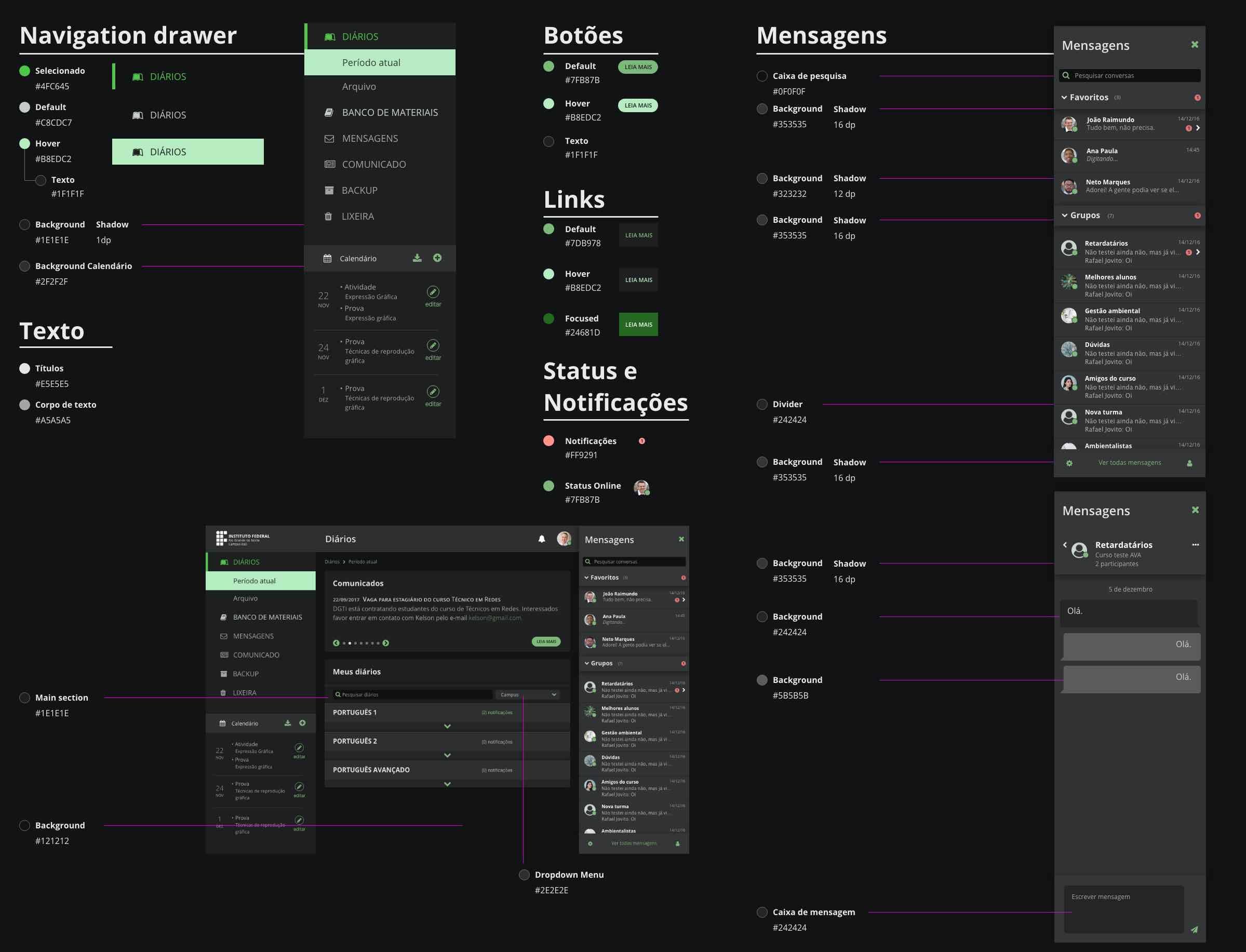
Following the creation of themes, we created style guidelines for developers to have as reference when implementing the designated colours from the design. These guidelines ensured that everyone on the team could maintain consistency throughout the project's development, simplifying the process for all involved.

Lessons learned
The importance of prioritising user needs and preferences when designing and developing a platform became evident. By incorporating user feedback, it was possible to identify and address usability issues and improve the user experience.
As a result, the project highlighted the need for ongoing adaptation and evolution of the product. Recognizing that user needs may change over time, it is crucial to start an iterative approach that allows for continuous improvement and updates to keep the product relevant and effective.
Through this project, I also learned the importance of effective communication and collaboration with developers. Understanding their perspectives and constraints in working with Moodle's complex coding structure was crucial to ensure a seamless integration of design and code. Being open to making necessary design adjustments and accommodating changes during the development process was essential to deliver a product.
In summary, these learning points contributed to a deeper understanding of user-centered design principles, accessibility standards , effective collaboration, and the importance of incorporating feedback throughout the design and development process.